Redoable graphics: xpyplot
Re-doable graphics versus reproducable research
If you do your research/development with sufficient discipline, which implies always maintaining scripts or notebooks which exactly reproduce all results, then it is generally little user effort to reproduce and adjust any plots or graphics that are part of that research. However, there may be a large computational effort – for example many of my plots are results are results of some core-hours of simulations and/or processing tens of terabytes of data.
Often however, lack of good tooling, pressures of time and the need
for rapid experimentation mean that we do not maitain turn-key
reproducible research. Yet, there is a nevertheless inevitably the
need to adjust or redo any graphics produced. Here I introduce a
library, xpyplot, that allows easily re-doable graphics in a
simple turn-key way.
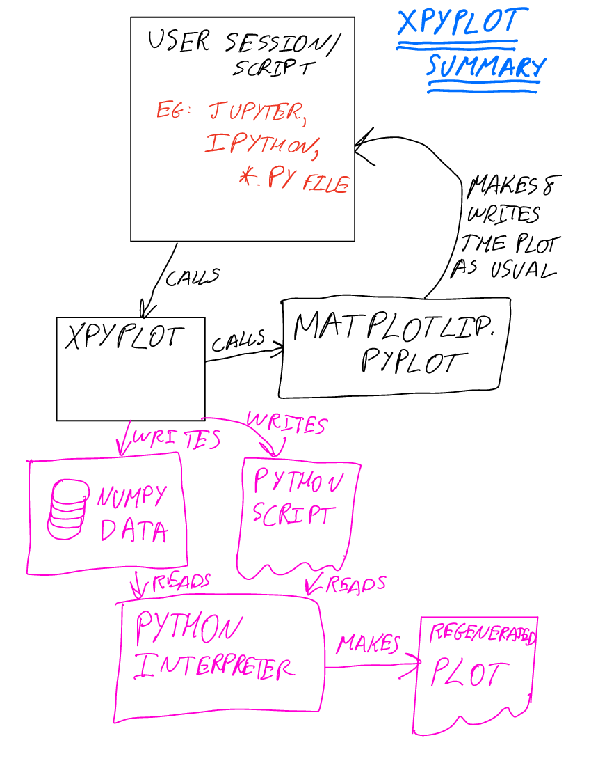
In simple terms xpyplot automatically saves the data and
commands used to produce any plots, allowing the plots to be redone at
a later stage without the need to recalculate any of the input data.
Example
Here is a simple motivating example. Suppose we plot following random points with a (known) relationship:
import numpy
x=numpy.random.uniform(0,2,10000)
dx=numpy.random.normal(size=x.shape)
plt.scatter(x, x+dx)
plt.title("test Plot")
plt.savefig("plot1.png")
It produces the following plot:
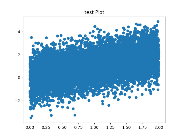
But the plot has a common problem: there are far too many points being overplotted so that it is not possible to judge the density of the points by eye. We can fix this easily by changing the transparency of the points, but how if re-run the script the random number generator will be advance and we’ll get a slightly different plot. How do we fix the actual plot we made?
If xpyplot was used1 the this is easily done. Together with the
above plot, the following script (and associated data) would have been
saved:
scatter1=numpy.load(open("plot1.scatter1.npy", "rb"))
scatter0=numpy.load(open("plot1.scatter0.npy", "rb"))
pyplot.scatter(x=scatter0, y=scatter1, **{}, s=None, c=None, marker=None, cmap=None, norm=None, vmin=None, vmax=None, alpha=None, linewidths=None, verts=None, edgecolors=None, plotnonfinite=False, data=None, )
pyplot.title(label="test Plot", **{}, fontdict=None, loc="center", pad=None, )
pyplot.savefig(fname="plot1.png", )
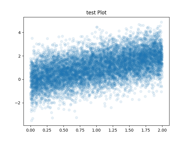
All we need to do to fix this is to change the above auto-generated script to change the transparency :
scatter1=numpy.load(open("plot1.scatter1.npy", "rb"))
scatter0=numpy.load(open("plot1.scatter0.npy", "rb"))
pyplot.scatter(x=scatter0, y=scatter1, **{}, s=None, c=None, marker=None, cmap=None, norm=None, vmin=None, vmax=None, alpha=0.1, linewidths=None, verts=None, edgecolors=None, plotnonfinite=False, data=None, )
pyplot.title(label="test Plot", **{}, fontdict=None, loc="center", pad=None, )
pyplot.savefig(fname="plot1.png", )
If we run the above script we get:
Use-cases
-
Plots generated during interactive Python use, through scripts, or use through Jupyter notebooks
- Which may need adjustment, e.g.:
- Change in colour schemes, axis extents, labels, keys
- Change of transparency, like/point styles to reveal detail hidden in original plot
- Producing EPS/PDF versions for publication
- Different views on the data (e.g., generating 2d histogram instead of scatter points)
- Or, where the data used to generate plots must be curated (e.g., in medicine-related publications)
Architecture
Main architectural decisions:
-
Built on top of the functional interface in the pyplot module of matplotlib2
-
Data for each plotting call are saved to a NumPy array file
-
When a figure is saved, all of the NumPy array files are collected and saved together with a script to reproduce the plot and placed next to the output plot
Why matplotlib?
Matplotlib is currently one of the world-wide leading libraries for plotting and data visualisation across many different fields. I built on top of matplotlib in this project because of this dominant position.
As a simple study to confirm frequency of use of matplotlib, I’ve made a random selection of 13 research articles posted on arXiv on 3rd December in the astrophysics field. ArXiv was used as the source code of articles is normally available, enabling easy identification of the plotting library used. The availability of the source was a selection criteria to be included in the study. I found 60% of PDF figures and 55% of PNG figures were created with matplotlib. The majority of remaining figures were astronomical images plotted with specialised software.
Implementation
The implementation is currently at an alpha stage but I am using it in my daily workflow. It is available at: https://github.com/bnwebcode/xpyplot .
Any contributions are welcome!